Corduroy has had a bit of a revival in recent years and it is a great fabric to play around with weaving. It’s a fairly simple structure which only requires four shafts.
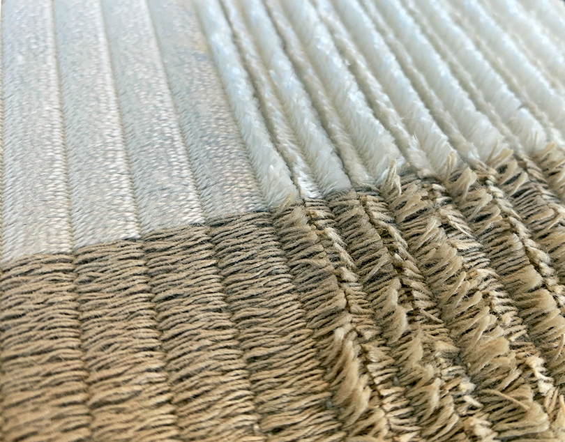
Corduroy is a ribbed fabric with a velvet like-feel to it. It has warp-wise ridges which are cut to create a pile. Due to their structure corduroys tend to be a heavier fabric and used for clothes such as coats, trousers, suits as well as for interiors.
When manufactured the ridges (ribs) tend to be quite narrow. The ribs are called ‘wales’. For standard clothing the number of wales per inch is around 10-12 but can vary from 6 (jumbo cord) to 18 (needle or pin cord).
The ribs are made up of stripes of weft floats with a narrow plain weave between them which is there to secure the floats down. The ground cloth behind is what holds everything together. These floats are cut down the center to create the characteristic pile.
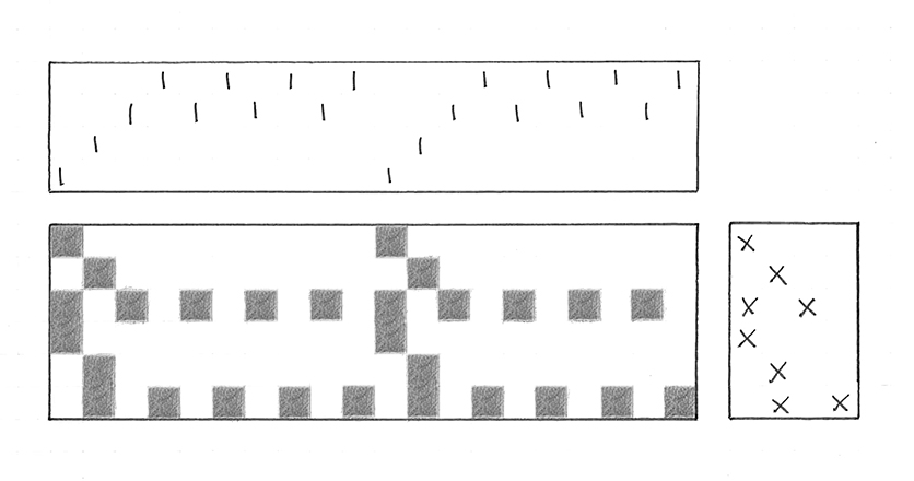
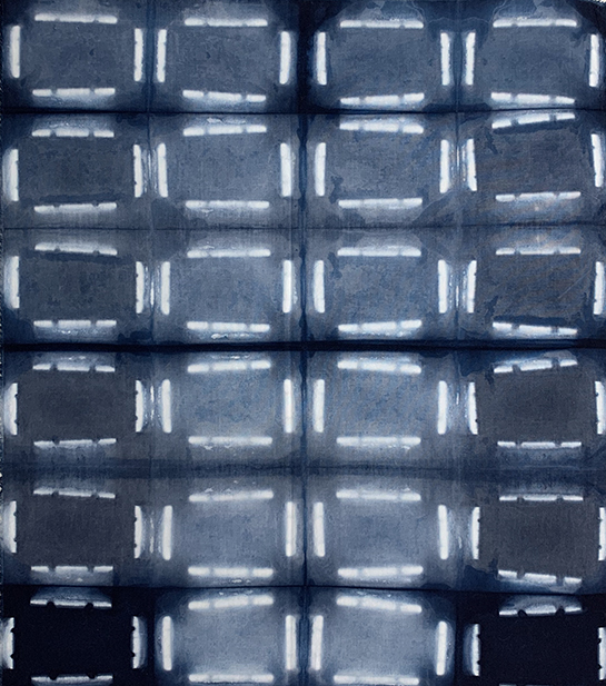
Below is the woven structure I used to weave my corduroy. I did make mine super chunky as you can see from the fabric pictures above. This was to allow me to easily see what was going on.
The corduroy below only uses four shafts. Two are for the plain weave background and the other two secure the floats down with plain weave. The picks alternate between one pick of weaving the plain weave background and two which weave the floats.
The corduroy in the image above was woven using 2/20nm spun silk and tussah silk. It was intested to see what effect the tussah silk had in comparison to the spun silk in terms of texture. The spun silk is so soft and luxurious while the tussah is more spikey. It would be fun to experiment how different yarns effect the texture of the pile.
When weaving I beat down quite firmly to ensure that the ground cloth was strong and the plain weave would hold the floats in place when cut. It is only the plain weave on shafts 1 and 2 that stop the floats from coming out.
To cut the floats I found it best to cut them while the fabric was still on the loom and under tension. I cut them as I went along, once I had woven about 5cm or so. The scissors need to be very sharp, small and pointy. The first couple of pairs of scissors I used were not small and sharp enough. Every time I cut the floats the scissors just pulled the weft floats out of the structure. It may take a few tries to find the right ones and of course as the width of the ribs gets smaller the scissors need to get smaller too.
A twill can also be used for the ground cloth. This will enable the cloth to be beaten down more and increase the density of the floats making a more luxurious fabric. Weaving the floats so that they are not all exactly the same width will also give a more rounded shape to the ribs.
A lot of fun fabrics could be created by varying the yarn type, width of rib and where the floats are cut (do they all need to be cut)?
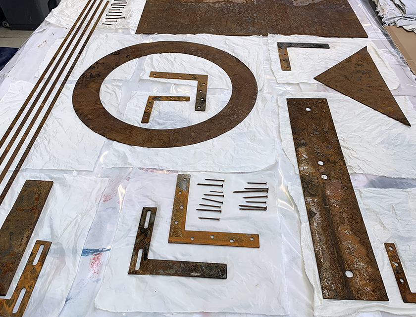
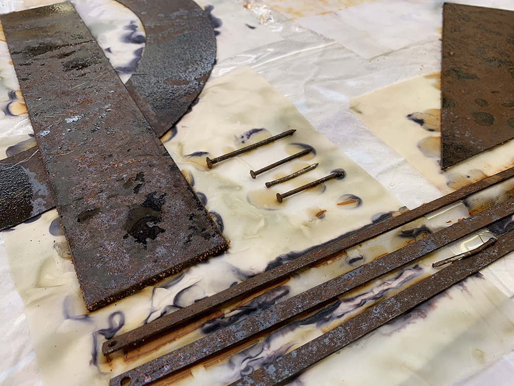
I have been enjoying experimenting with rust printing which is something I haven’t done before. It is essentially a way of transferring rust from an object to fabric.
Freshly rusted objects seem to work best. If they aren’t freshly rusted they need to be scrubbed with a wire brush or something similar to remove all the old loose rust. The fresh rust underneath is what we need to transfer.
The rusty objects need to be pressed on to the fabric. A kind of sandwich is made – blanket, plastic, damp fabric/paper, damp rusty objects, damp fabric/paper, plastic and the finally another blanket. The idea is to create a warm, humid environment around the rusty object to create more rust which will mark the fabric. The pressure and blanket encourages the fabric to mould around the objects to enable the rust to transfer to the fabric as much as possible. This all needs to be weighted down as evenly as possible so a big board and weights works well. This all needs to be left for 24-48 hours.
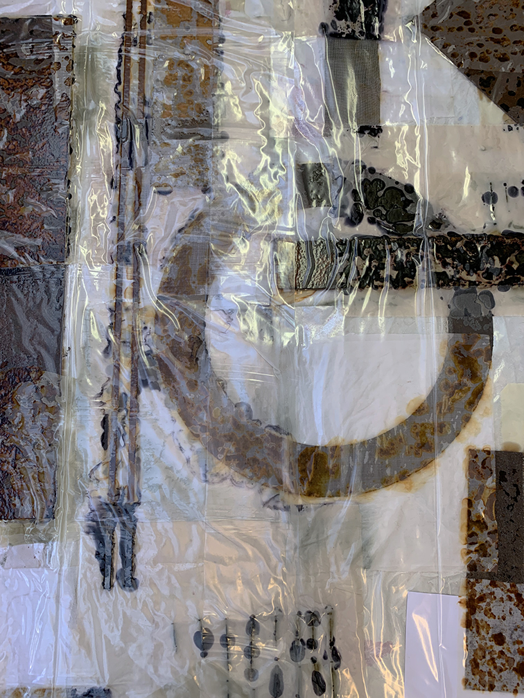
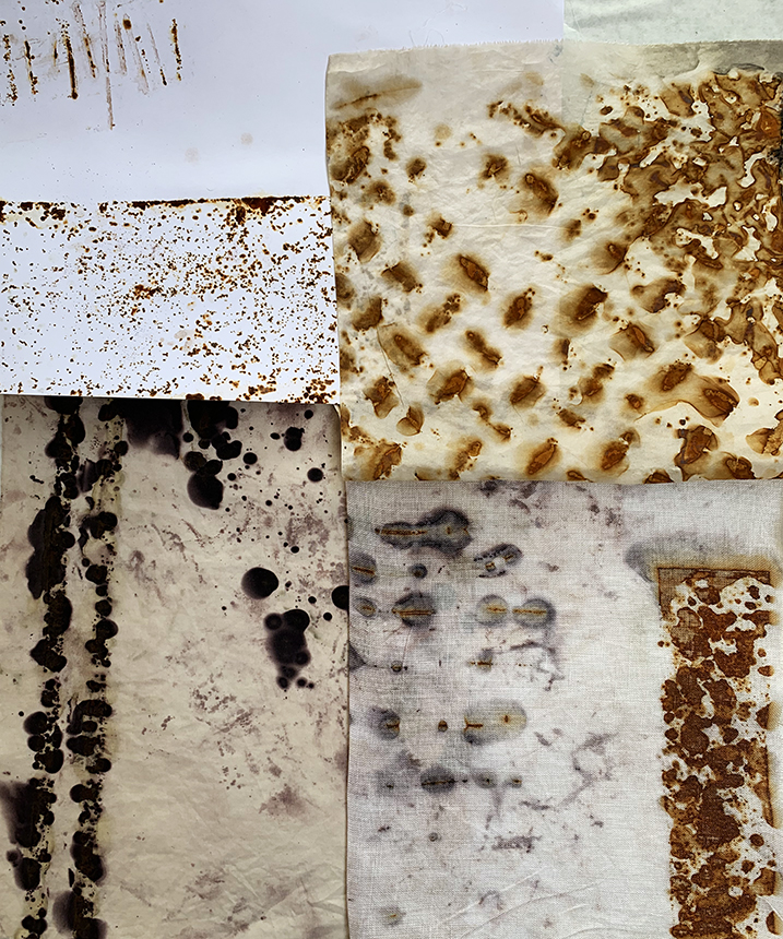
You’ll notice that some of the rust prints are black. For these samples the fabric has been soaked in a ferrous sulphate solution. The rust reacts with the ferrous sulphate and turns black.
I would love to experiment with this some more and test different fabrics/papers and objects, particularly on paper.
The things that effect how well it turns out are: getting the fabric/rusty objects the right dampness, how well rusted/scrubbed the objects are, how long it is left, which fabrics are used.
Some really interesting prints can be achieved with this method on a variety of fabrics. With some testing the prints can be made very detailed and clear.
I have recently been experimenting with indigo. It was a process I had been interested in for a while but didn’t know much about it. It’s been fun trying out different techniques and I have learnt a lot.
I started off with a very technical approach, asking questions such as what happens if I dip fabric once or ten times, does it make a difference if I use a full strength vat or half strength. I quickly realised that indigo’s unpredictable nature doesn’t lend itself to such a scientific approach.
Before I tell you about what I have learnt let’s talk about what indigo is…
Indigo is a natural dye which is used to dye fabric. Traditionally indigo was used to dye denim but a synthetic dye is now used. I use the word dye loosely when talking about indigo because what it actually does is stain the fabric. Unlike synthetic dyes it does not penetrate the fibres in the fabric but rather holds on to the surface of the fabric. If you dye something with indigo and then cut through it, the middle will still be the original colour. This also means that it is great for resist techniques.
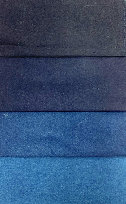
The process for dyeing with indigo is to make up a vat containing various chemicals which create the optimal conditions for the indigo grains. The vat needs to be alkaline for the dye to work. It also needs to be reduced, meaning that the oxygen has to be removed. Salt is also used, as in a lot of dyeing recipes, to ensure the indigo adheres to the fabric. Indigo is not soluble in water meaning that the particles are suspended in the liquid. When the indigo is suspended in the alkaline, reduced solution it is yellowy green in colour until it comes in to contact with oxygen which turns it blue.
To dye fabric… Damp fabric is lowered slowly in to the indigo vat and kept under the surface for 1 – 3 minutes. It is then gently lifted up. It will look green but quickly turn blue as is oxygenates in the air. Once fully oxygenated it can then be dipped again. The number of dips needed depends on the required colour. It is important that as little air is introduced to the dye vat as possible otherwise the vat will become oxygenated and won’t work.
I found that dipping my fabric for about 1.5 minutes and leaving it to oxygenate for about 3 minutes worked well. Some people say that putting your fabric into a citric acid bath after the final oxygenation brightens the colour but I didn’t find it made much difference. This may be more important when using animal fibres as the alkalinity of the vat can damage the fibres, these prefer acidic conditions.
I started off with the idea that I can compare and investigate thoroughly if I start with a control set of samples – cotton poplin fabric dipped as above but with varying dips (1, 3, 5 ,10). Then I could carry on recreating these but varying certain aspects to see the effects e.g. different dip times, washing between dips, using citric acid. However, I quickly realised that indigo is unpredictable. The vat changes as it is used, the indigo concentration decreases with more dips, the vat becomes oxygenated. A 5 dip sample will not be comparable the next five dip sample. It is unpredictable. Which is part of it’s charm.
It was more difficult to get a beautiful even colour than I thought it would be. I found that when it was oxygenating any small inconsistency in the fabric would cause a ‘blemish’. Where water sits on the fabric, either at the bottom when hanging or in the slight creases of the fabric, it wouldn’t darken as much as the rest of it. Also, if a thread from the edge of the fabric sat over it, that part wouldn’t darken as much. This is because the oxygen couldn’t get to the indigo on the fabric as easily. I found that I got a more even colour if I washed the fabric in cold water immediately after each dip. Also the more dips the more even the colour.
I was hoping to be able to get a good light colour as well as the classic dark indigo blue but didn’t manage to. If I did fewer dips I got a light colour but it was uneven and a half strength vat didn’t produce a lighter colour with comparable dips.
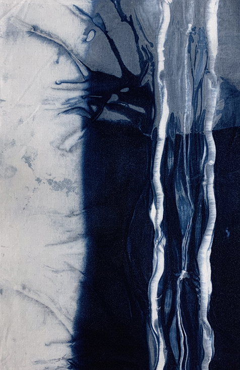
The first resist technique above was created by wrapping fabric around a plastic tube and securing it with elastic bands. I found it very difficult to keep the white bit clean and where the fabric was wrapped over itself I couldn’t get the colour as dark as I would have liked. This is due to the indigo not penetrating the fibres as mentioned above. The second resist was created by folding the fabric and securing with bulldog clips. I found that when using resist I needed to dip more times to darken the colour of the fabric wrapped in the middle. It also needed longer to oxygenate and while it was oxygenating it needed to be opened as much as possible without removing the resist to allow the fabric in the middle to oxygenate.
Overall I found the process really interesting and would love to incorporate it in to some of my woven work.
This is only a brief summary of my experiments in indigo but if you would like more information on my techniques or discuss the process please feel free to comment or email me.
After our real life adventure at the Victoria and Albert Museum I was approached by a children’s author, Lucia Wilson. She was inspired by seeing Cedric on tv and wanted to write a book based on our story.
In story one, Cedric is having an exciting time being the centre of attention in the V&A Museum. When a young man called Troy decides to bear-nap Cedric, things take an alarming turn. Freddie and Julie, two young children who witness this crime, decide to play detective.
In story two, Cedric meets the Button Bear, trapped in a dark, miserable basement living with the meanest tailor in London. Cedric gathers a team of chums from London Zoo, Polo the penguin and a cheeky gang of squirrel monkeys, and is determined to rescue the Button Bear and to help him find his way home.
In story three, Cedric sets off to Paris for a long-overdue reunion with his cousin, Velours, a blue velvet cat. Cedric was shocked to see that Velours was now disabled; one of her back legs has been replaced with a rubber wheel after a horrible accident. Cedric’s sadness quickly disappears when he realises that Velours hasn’t let her disability hold her back, in fact, he was thrilled to learn that she was about to run in Le Grand Dash, the biggest race in the Pet Paralympics – and she is the favourite to win!
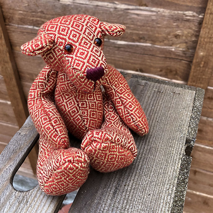
I created Cedric in 2012 after I graduated from a woven textiles degree in Norwich. The colours have been inspired by the colours of autumn. I just love the muted reds, oranges and yellows found at that time of year. He is entirely made by hand using traditional techniques. His fabric is handwoven using a super soft Tencel yarn with a twill based structure. He is hand sewn together and has cotterpin joints, glass eyes and a stitched nose. Inside he is full of tiny glass beads which gives him a mouldable, sturdy weight.
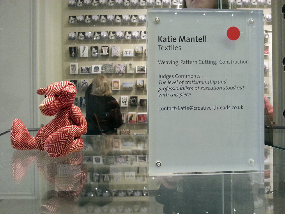
Just after I made him, Cedric and I appeared on BBC 2’s Paul Martin’s Handmade Revolution. As a winner Cedric was displayed at the Victoria and Albert Museum where he was adopted.
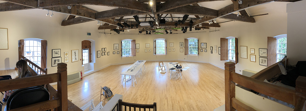
Today I went over to Prema Gallery in Uley, Gloucestershire, to see Carole Bury’s solo exhibition.
Carole works with drawings, paper and stitch to create beautiful artwork. Her work is subtle often using a monochromatic colour scheme and white on white. She is inspired by nature, countryside and birds. She works a lot with feathers exploring three dimensional structures of white paper and white thread, sometimes picking out detail in gold leaf.
I have always loved the tactile qualities of stitch on paper and Carole does this so well.
The actual gallery is an amazing space. An octagonal room with lots of natural light. Carole’s work makes it a calm space to be in. Her work is displayed almost continuously around the room telling the story of the seasons. Even though there is very little colour she has captured the soft, dense snow of winter and energy of spring.
She also has tables set out in the middle of the room where she is continuing her practise. I always love to see the work behind the final pieces. It tells a story of how the work is developed. There is always something raw, energetic and experimental this type of work.
We couldn’t help ourselves and purchased one of her drawings to take pride of place in our living room.